Looking back at you preliminary task, what do you feel you have learnt in progression from it to the full product?
Friday, 19 February 2016


Thursday, 18 February 2016

Wednesday, 17 February 2016
Question 5
How did you attract/address your audience?
Attract
Attracting the audience is all about trying to engage the audience into my product, I tried to do this though amending the conventions of the magazines especially the:
Brief analysis from feedback:
From the survey, it is clear that most people do understand that it is a RnB magazine and that I have been successful in representing my target audience.
The most common comments towards 'what attracts you to this magazine' were:
Attract
Attracting the audience is all about trying to engage the audience into my product, I tried to do this though amending the conventions of the magazines especially the:
- colours
- content
- photographs
- masthead
- layout
In order to please my audience I had to research into things that they like, I found this easy as I could gather some information through observations as I am within the age group 16-26.
When attracting the audience, my overall aim was to create an unique magazine that was significantly different to any other RnB magazine aimed at 16-26 year olds that fitted all the codes and conventions that a magazine should portray.
In my double page spread, i have used my audiences fascination with social media, allowing them to have a say and get involved using it, this means that I could engage the audience by using some of the most used social medias e.g. twitter and instagram, the thought of their question being asked to a celebrity would attract them into buying other issues. I also think this is a good method as it is unique to the print industry as it works in favour for both its digital and print industry, creating intertextuality.
Adress?
I dressed my audience through annotating and understanding other ways in which magazines try to address their audiences e.g. for images, if the main subject is looking straight then it creates a mode of address which speaks to the audience.
Language
I tried to address what genre my magazine was through the language used e.g. I used 'hits' as opposed to beats to illiterate the RnB feel.
Photos
Using a Nikon D60 i took formal portraits, whereby the artists posed for the camera. Most of these photos where taken on a white background so that they would 1. look more professional and 2. be easy to edit (if needed.)
I tried to address the audience by ensuring that the artists where wearing typical late teen attire and the clothes worn where from popular loved brands e.g. Topshop, allowing a connection to be made between the artist and the audience meaning a relation can occur resulting in an attraction to the consumer.
Audience feedback- survey monkey
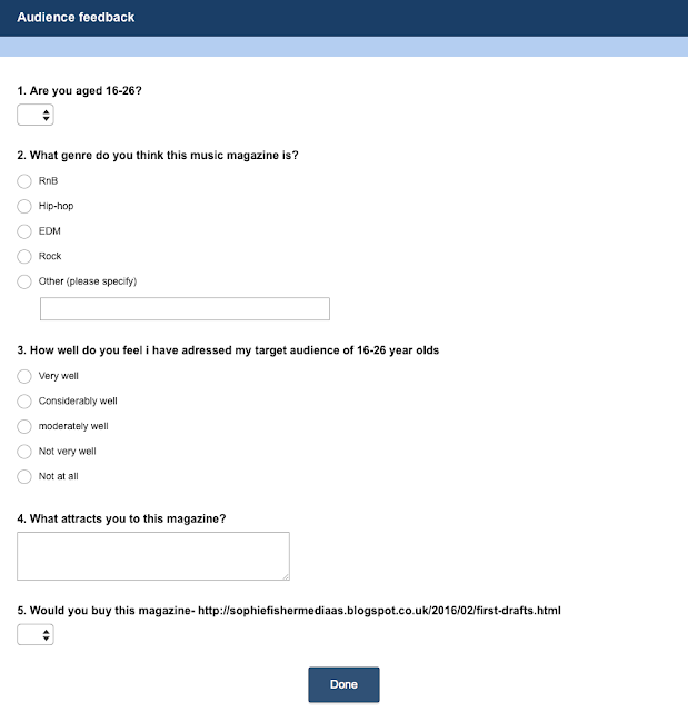

Brief analysis from feedback:
From the survey, it is clear that most people do understand that it is a RnB magazine and that I have been successful in representing my target audience.
The most common comments towards 'what attracts you to this magazine' were:
- price
- colour
- content
- looks interesting
- layout
Tuesday, 16 February 2016
Question 4
Who would be the audience for your media product?
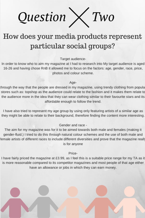
Age-
My target audience for my magazine is late teens to early twenties (roughly between the ages of 16-26.) Although this is a wide range of ages I believe that the content inside can cater more than one age e.g. an interview with a famous celeb would appeal to both a 16 and 23 year old.I purposely made my magazine lack vibrant colours, children, childish props in order to appeal to an older audience.I have also chosen this audience as it is an age where my audience would be able to start attending and appreciating tours as they become engrossed into celebs.
Gender-
I have tried to keep my magazine gender mutual as both boys and girls both equally enjoy RnB music, i have used neutral colour scheme and included both male and female artists, appealing to either gender. Having said this, I do feel that girls are more likely to buy this RnB music magazine so hopefully the female on the front cover would be a point of attraction to males.
Ethnicity-
I have not made a conscious effort to aim my magazine at a certain ethnicity, although, RnB artists typically black i have included people from different ethnicities as I would rather it appeal to all ethnicities and prove this by have a vary in my magazine.
Preferences-
The type of people I have aimed my magazine at are typical late teens e.g college and university students enjoy discovering new artists, can travel to see some of their favourite existing ones in clubs as this magazine updates my audience on where their artists will be and be able to follow them on places they will be and what you can expect from them. As RnB is music that many people can enjoy, I have tried to keep this magazine understanding of everyone meaning that it won't just be aimed at one gender or ethnicity, this also means that the magazine can be shared around friendship group or just left on the coffee table for anyone to enjoy.
Using 'Avachara' I have created characters of who what I feel my audience would typically look like:


Monday, 15 February 2016
Sunday, 14 February 2016

Saturday, 13 February 2016
Question 1
In what ways does your media product use, develop or challenge forms and conventions of real media products?
What I have created:
I have created a RnB music magazine called 'Motion' aimed at 16-26 year olds. The title of the magazine was inspired from old style RnB and I have tried to incorporate the mixing of the old RnB with the new by using black and white pictures. I also took inspiration from the music magazine 'VIBE' as it was both music and atmospheric related. The interest of my target audience is typically other artists of a simular age. I have kept to a very subtle monochrome colour scheme wiht a subtle pop of colour because that is tendy and understated amongst my target audience.
How my magazine fits the conventions of a magazine:

Using Picktochart, I give further details and analysis on the codes and conventions in my magazine and how they compare to traditional ones.
Friday, 12 February 2016
Final Edits


Update on front cover:
- Removed unnecessary lines
- Added background paint splatter
- Shadow around photos- makes them stand out more
- Black off-centred boarder around, continues theme from front cover
- Made sure
- Added white guidance lanes to make it look more organised
Update on double page spread:
- Added a shadow around the photo
- altered text around the image
- centred the web address
- ensured that text doesn't cross centre line
Friday, 5 February 2016


Subscribe to:
Comments (Atom)