
What was the task?
The task was to create a mock up of a magazine front cover and contents page for a school magazine using photoshop.
How did it help me?
Although I had quite an idea of how to use photoshop (though previous use in photography editing and past media classes|), it helped to me familiarise myself with photoshop e.g. how to insert shapes, change their opacity and gave me a reminder of how to install interesting fonts from 'dafont' onto photoshop.
This task also helped me to create layout for a magazine displaying all the codes and conventions e.g. the barcode and where to place it; this was the most helpful thing about this task as it is easy to annotate many magazines, but, until you have created a mock-up one for yourself, it creates a clearer understanding of what your magazine needs, where to place items and the type of language used.
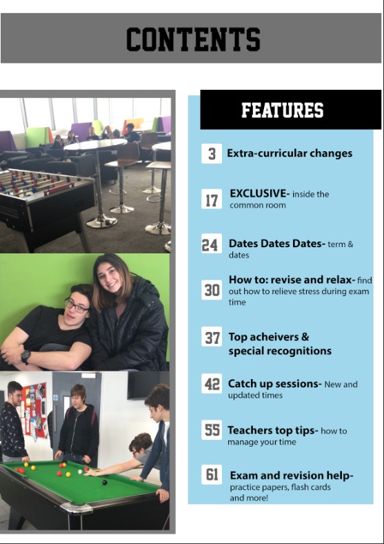
Strengths
- I like the angle of the photo as it allows for text either side and covers most the page.
- I have used a clear font so it is easy to read.
- It has a clear and structured layout so it looks tidy and easy to follow.
Weaknesses
- It is very plain and not exciting e.g. no clear colour scheme has been established and there is nothing exciting (reader incentives|) e.g.'EXCLUSIVE'.
- Another weakness is that there nothing stating the price of the magazine so the reader doesn't know how much they are paying (even if the magazine was free they wouldn't know- this may deter the ready away from taking one as they think they have to pay.)
- The writing isn't clear for the cover lines (especially the purple as it doesn't stand out enough and fades into the background.)
- Contents page- text, numbers and boxes aren't positioned correctly
How I can encorporate learning from this task into my production work
From this task I can establish what I what I liked for my magazine front cover, what i disliked/ need improving on for my production.
No comments:
Post a Comment