Looking back at you preliminary task, what do you feel you have learnt in progression from it to the full product?
Friday, 19 February 2016


Thursday, 18 February 2016

Wednesday, 17 February 2016
Question 5
How did you attract/address your audience?
Attract
Attracting the audience is all about trying to engage the audience into my product, I tried to do this though amending the conventions of the magazines especially the:
Brief analysis from feedback:
From the survey, it is clear that most people do understand that it is a RnB magazine and that I have been successful in representing my target audience.
The most common comments towards 'what attracts you to this magazine' were:
Attract
Attracting the audience is all about trying to engage the audience into my product, I tried to do this though amending the conventions of the magazines especially the:
- colours
- content
- photographs
- masthead
- layout
In order to please my audience I had to research into things that they like, I found this easy as I could gather some information through observations as I am within the age group 16-26.
When attracting the audience, my overall aim was to create an unique magazine that was significantly different to any other RnB magazine aimed at 16-26 year olds that fitted all the codes and conventions that a magazine should portray.
In my double page spread, i have used my audiences fascination with social media, allowing them to have a say and get involved using it, this means that I could engage the audience by using some of the most used social medias e.g. twitter and instagram, the thought of their question being asked to a celebrity would attract them into buying other issues. I also think this is a good method as it is unique to the print industry as it works in favour for both its digital and print industry, creating intertextuality.
Adress?
I dressed my audience through annotating and understanding other ways in which magazines try to address their audiences e.g. for images, if the main subject is looking straight then it creates a mode of address which speaks to the audience.
Language
I tried to address what genre my magazine was through the language used e.g. I used 'hits' as opposed to beats to illiterate the RnB feel.
Photos
Using a Nikon D60 i took formal portraits, whereby the artists posed for the camera. Most of these photos where taken on a white background so that they would 1. look more professional and 2. be easy to edit (if needed.)
I tried to address the audience by ensuring that the artists where wearing typical late teen attire and the clothes worn where from popular loved brands e.g. Topshop, allowing a connection to be made between the artist and the audience meaning a relation can occur resulting in an attraction to the consumer.
Audience feedback- survey monkey
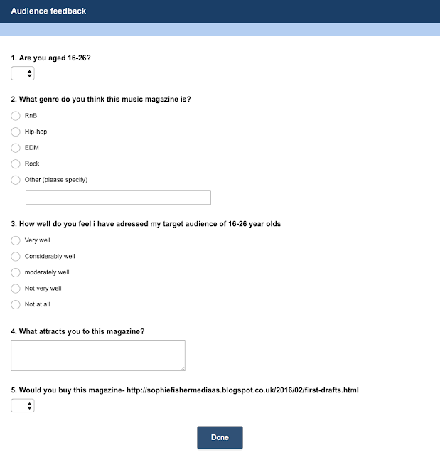

Brief analysis from feedback:
From the survey, it is clear that most people do understand that it is a RnB magazine and that I have been successful in representing my target audience.
The most common comments towards 'what attracts you to this magazine' were:
- price
- colour
- content
- looks interesting
- layout
Tuesday, 16 February 2016
Question 4
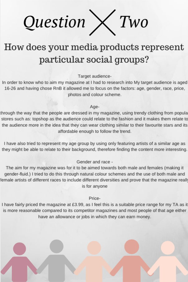
Who would be the audience for your media product?
Age-
My target audience for my magazine is late teens to early twenties (roughly between the ages of 16-26.) Although this is a wide range of ages I believe that the content inside can cater more than one age e.g. an interview with a famous celeb would appeal to both a 16 and 23 year old.I purposely made my magazine lack vibrant colours, children, childish props in order to appeal to an older audience.I have also chosen this audience as it is an age where my audience would be able to start attending and appreciating tours as they become engrossed into celebs.
Gender-
I have tried to keep my magazine gender mutual as both boys and girls both equally enjoy RnB music, i have used neutral colour scheme and included both male and female artists, appealing to either gender. Having said this, I do feel that girls are more likely to buy this RnB music magazine so hopefully the female on the front cover would be a point of attraction to males.
Ethnicity-
I have not made a conscious effort to aim my magazine at a certain ethnicity, although, RnB artists typically black i have included people from different ethnicities as I would rather it appeal to all ethnicities and prove this by have a vary in my magazine.
Preferences-
The type of people I have aimed my magazine at are typical late teens e.g college and university students enjoy discovering new artists, can travel to see some of their favourite existing ones in clubs as this magazine updates my audience on where their artists will be and be able to follow them on places they will be and what you can expect from them. As RnB is music that many people can enjoy, I have tried to keep this magazine understanding of everyone meaning that it won't just be aimed at one gender or ethnicity, this also means that the magazine can be shared around friendship group or just left on the coffee table for anyone to enjoy.
Using 'Avachara' I have created characters of who what I feel my audience would typically look like:


Monday, 15 February 2016
Sunday, 14 February 2016

Saturday, 13 February 2016
Question 1
In what ways does your media product use, develop or challenge forms and conventions of real media products?
What I have created:
I have created a RnB music magazine called 'Motion' aimed at 16-26 year olds. The title of the magazine was inspired from old style RnB and I have tried to incorporate the mixing of the old RnB with the new by using black and white pictures. I also took inspiration from the music magazine 'VIBE' as it was both music and atmospheric related. The interest of my target audience is typically other artists of a simular age. I have kept to a very subtle monochrome colour scheme wiht a subtle pop of colour because that is tendy and understated amongst my target audience.
How my magazine fits the conventions of a magazine:

Using Picktochart, I give further details and analysis on the codes and conventions in my magazine and how they compare to traditional ones.
Friday, 12 February 2016
Final Edits


Update on front cover:
- Removed unnecessary lines
- Added background paint splatter
- Shadow around photos- makes them stand out more
- Black off-centred boarder around, continues theme from front cover
- Made sure
- Added white guidance lanes to make it look more organised
Update on double page spread:
- Added a shadow around the photo
- altered text around the image
- centred the web address
- ensured that text doesn't cross centre line
Friday, 5 February 2016


Sunday, 31 January 2016
Unused photos


Why weren't these photos used?
From the shoots that I did, these are my unused photos, they haven't been used as they may be blurry e.g. top right of the first page, out of focus- middle and bottom right on the first page.
The pictures may have been used if the model has been in funny positions e.g. the 3 down the side of the first sheet and 3 across the middle of the second.
Another reason the photos may have not been used is if the model is not using mode of address (looking into the camera as it means that they don't attract the audience in the same way.) e.g. top middle of second sheet
The final reason a photo may not have been used is if it was taken from a funny angle e.g. the bottom 3 of the second sheet.
Friday, 15 January 2016
Production time plan
Monday 18th Jan
- Gather all photos
- Open 3 documents
- Download font for title
- Start writing interview
Wednesday 20th Jan
- Finish writing article
Thursday 21st Jan
- Gather list of tour locations
- Start writing title slogan and articles on front cover
Friday 22nd Jan
- Start write all articles for contents page
Monday 25th Jan
- Place and number pages on contents page
- Add photos onto contents page
Tuesday 26th Jan
- Write editors note
- Write links for social media
- add photos
- Add concrete background
- Add black sheer panel
- order text and numbers into columns
- Write title content page
- edit and place photos
Thursday 28th Jan
- Finish contents page
Friday 30th Jan
- Add photos onto front cover
- edit front cover photo
- Find and place background
Monday 1st Feb
- Finish front cover editing
Tuesday 2nd Feb
Start double page spread:
- add title
- subheading
- full double article
Wednesday 3rd Feb
- Add photo
- Write all locations for event
- Finish editing page e.g. placing
- Finish any final editing
- Make it perfect
Friday 5th Feb
DUE DATE!!!
Thursday, 14 January 2016
Audience feedback- double page spread article
Having asked some of my audience what they had thought on my article and how I could improve it, many of the audiences feedback suggested that the article was too short especially to fill a double page spread and that I needed a more original way to connect the audience to the magazine.
How I used the audience feedback to fix this problem
I added a side article that reached out to members of the singers pre-existing fan base using twitter, suggesting that if they asked a question, Elle would answer it and it may possibly feature in the first edition of 'motion' magazine.
Here is the side article:
We have asked our motion readers
to send in questions they would lilke
to ask you
@leahhann asked:
‘Where was your favourite place to perform and
why?
Anya: I REALLY enjoyed the Royal Albert Hall as the
audience were really envolved and we bounced
enjoy off each other- it was a lot of fun’
@ilovemotion asked:
‘Will you come to Liverpool- p.s. I LOVE YOUR
MUSIC’
Anya: thank you! and yes we are looking to add
more dates and places for my tour in june
@astarkk1 asked:
Will you be releasing another album?
Anya: Yes! I am currently spending my life in the
studio, all in preparation for my new album.
@josh_fline asked:
‘Who would you like to collab with?’
Anya: Beyonce of course!
Thursday, 7 January 2016
My article
Elle Stark wass just you average 20 year-old
who had big hopes and ambitions of making
it big in in the RnB industry. Fast forward a
few years and she has gone from a sophisticated
secretary to pop princess already completeing
a UK national tour and releasing an album we
beleive that she has the potential our next new
Rhianna. Oozing with qwerk and sex appeal, we
beleive that this 22 year-old could be HUGE.
Hi Anya, thank you for coming to
speak to us
No probem, I am happy to be here.
We constantly have your album
on repeat, who was your inspiration?
I love Rhianna and the type of edgy music
she makes -she was definetly my main inspiration
for this album. I also enjoy listening to some 90’s
classics such as Nelly and really tried to gain the
original RnB roots in my music.
Congrats on completing your
‘whirlwind’ tour, how was it?
Thank you so much, I am so releieved and
sad in a away, I’m sad it’s over but so
glad because especially towards the end it
became so exhausting.
You’ve had a pretty crazy journey,
you became an over night sucess,
how are you coping with your new
found fame?
I like to refer to it as my ‘whirlwind journey’
I don’t know how i have coped, I just try
to appreciate every moment of it while it
lasts
‘I just try to enjoy
every moment of it
while it lasts’
After the year you’ve have had,
what are your plans next?
Festivals- I would love to participate in
Glastonbury, that would be like a dream for
me, I just love the atmosphere and the vibe.
I would also like to take my album
internationally
Internationally?
Yes, I’ve booked some studio time in LA
with some major producers, I can’t give too
much away at the moment
Tuesday, 5 January 2016
Inspiration board

I have created an inspiration board from some of my favourite covers from either Billboard or Vibe magazine, I have specifically chosen these 2 as I feel these are the 2 most famous that appeal to my target audience, using qualities such as a clean colour scheme (using a max of 4 colours.) Another thing I noticed is that in all these covers the artist id looking directly into the camera creating a mode of address, I would like to include both of these qualities in my final piece.
Sunday, 3 January 2016
Colour scheme idea + why the black and white


Why the black and white?
The first is that it is different, I really wanted my magazine to stand out compared to other magazines and having asked my target audience, felt this was an appropriate and cool way to make my magazine unique as it creates an air of mystery as features such as eye and hair colour aren't aa main feature it shows their lack of importance and leaves something to the imagination.
Another reason why I chose to use a monochrome colour scheme is because I feel it really creates a distinct genre association as you can often connote RnB to black and white typical old jazz bands therefore having this black and white element means that people can make the instant association between new and old RnB and, I personally, feel this is the bast way to convey the idea of RnB whist keeping it current.
My thoughts
I personally am leaning to using the green and greyscale colours as I feel it is a cool colour in at the moment so we can really see the contrast between old and new RnB and it is unisex appealing to a much larger target audience
Saturday, 2 January 2016

Subscribe to:
Comments (Atom)