The task was to create a mock up of a magazine front cover and contents page for a school magazine using photoshop.
How did it help me?
Although I had quite an idea of how to use photoshop (though previous use in photography editing and past media classes|), it helped to me familiarise myself with photoshop e.g. how to insert shapes, change their opacity and gave me a reminder of how to install interesting fonts from 'dafont' onto photoshop.
This task also helped me to create layout for a magazine displaying all the codes and conventions e.g. the barcode and where to place it; this was the most helpful thing about this task as it is easy to annotate many magazines, but, until you have created a mock-up one for yourself, it creates a clearer understanding of what your magazine needs, where to place items and the type of language used.
Strengths
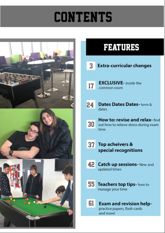
I like the angle of the photo as it allows for text either side and covers most the page.
I have used a clear font so it is easy to read.
It has a clear and structured layout so it looks tidy and easy to follow.
Weaknesses
It is very plain and not exciting e.g. no clear colour scheme has been established and there is nothing exciting (reader incentives|) e.g.'EXCLUSIVE'.
Another weakness is that there nothing stating the price of the magazine so the reader doesn't know how much they are paying (even if the magazine was free they wouldn't know- this may deter the ready away from taking one as they think they have to pay.)
The writing isn't clear for the cover lines (especially the purple as it doesn't stand out enough and fades into the background.)
Contents page- text, numbers and boxes aren't positioned correctly
How I can encorporate learning from this task into my production work
From this task I can establish what I what I liked for my magazine front cover, what i disliked/ need improving on for my production.
Having played around on 'dafont', I picked (and narrowed down) a few of my favourite fonts that I liked for my title and then recreated it (on the right hand side) with one of my possible title names 'Motion' to get a feel of what it would look like, and ultimately, help me decide on my font title.
Here are some of my slogans ideas for my magazine-
- Feel the motion
- Buy IT, Read IT, Love IT
- Music to your eyes
- It's all in the motion
- You RnB pick up
- Read 'n' Buy
- love, listen, read
- RnB- music how it should be
- Your music, your way
- Anytime, anyplace, motion
- More than just music
- Read 'n' believe
For this task, I showed my target audience potential name ideas for my music magazine and asked them what where their favourite and why and what ones they least liked and why
This was the mind map I had presented to them. I divided up the name ideas into 4 categories: current RnB, classic RnB, Upbeat names and hiphop related, this would make it easier for them to feedback and give me an insight into what type of RnB my audience are most interested in.
From these interviews it was clear that the least liked magazine names came from the 'classic RnB' section.
I found that people often favoured the upbeat names such as hype, B.E.A.T, and DTB (drop the beat.)
People often took a particular liking to the names 'Latch' and 'Motion'.
Names people often didn't take a liking to was 'extcasy' as they felt it was inappropriate and portrayed the wrong vibe especially if a younger person wishes to read it.
My personal opinion:
I personally am a fan of the names latch and DTB and Motion.
Photo shoot day 1- 12/12/15 Location- My house Clothing- current/trendy smart casual clothing, preference brand: Topshop
Ideally, I would like the model to be wearing their own casual clothing as it creates a relatable idea of fashion e.g. what is suitable/fashionable towards the audience. This establishes a connection between the reader and the magazine as they may like an item of clothing and want to wear something similar as it is wearable and not too extravagant like how most celebrities dress for magazines.
I have also used everyday non-artificial settings e.g. house as most of my target audience would still be in education therefore they can relate to everyday, non-artificial settings.
I think that using these relatable settings my magazine would stand out more as it is unlikely that a magazine would do a photoshoot in an everyday setting, again reinforcing a relatable vibe.
Having asked my target audience ( a survey of 56 people) over 88% of participants agreed that using everyday settings to take photos of people in causal clothing would attract them more to buying a magazine compared to a more formal one.
Any problems and how I overcame them:
one model arrived wearing all white, due to the photos being in black and white I had to offer them a change of clothing so that they wouldn't be disguised into the background
Some photos didn't fit my criteria so I had to take some photos in school to compensate for 'unusable photos'
Problems that I encountered and how I resolved them:
After having completed this task on the software 'Go Animate' I was unable to upload it onto my blog as the 14 day free trail had expired. I have recreated my work using powerpoint and uploading it onto slideshare as I felt it was a suitable software to present the uses and gratifications theory on.
What was the task?
The task was to understand why people use the media, this was best explained through Blumner and Katz Uses and Gratifications theory
What did I learn?
I learnt that their was valid reasons as to why a person may chose to listen to/read a certain type of media and that these people do it according to their needs for it e.g. a stressful day may lead to someone wanting to watch an entertainment program or students may watch documentaries to be informed on a certain topic
How will this information help improve my work?
Knowing this information, I can now create a magazine that will provide the correct uses that my audience would like it to be used for, ideally it would be used for the purpose of information, entertainment and escapsim (the interviews I conducted also helped me to understand this.)
After spending an hour creating a 'go animate' for my uses and gratifications theory, I was unable to finish editing before my '14 day free trial' finished.
On the bright side, I think i'll really understand and remember why people use the media (that is AFTER my second attempt at this presentation.)
This is my analysis on the February 2010 double page spread of Cheryl Cole, when analysing I followed these rough guidelines:
The artist- who are they? Large photo is more likely to bring attention to that page as if she is a big artist it is more of a selling/attraction point, may be used as poster when finished with magazine
Type of shot Background, does her makeup and facial features contrast the colour background i.e. dark eyes on white background, does the makeup make her look gothic or scary Hair and the way its styled, is it a crazy hairstyle? Is there a constant theme i.e. black eyes and red lipstick = punk rock contrasting photos- confident VS dark and mysterious
Font- connotates for being girly and soft harsh and bold contrasting fonts could as a split personality
Colour scheme Is it the same colour as the front cover- Q magazine tend to follow through with their red, white and black theme to maintain brand identity
Small typeography on bottom corner of the page Intertexuality- the idea of connecting 2 types of media, likely to be on every printed page, if they enjoy that article may decide to look for other content
Q- anchors the magazine name into the audience
Page number Easy access to page, date makes for a more sophisticated look, good for collectors
Quotes- pulls away important or shocking parts of the story – ‘don’t know what I look like anymore’ there is proof in the background colour of the 2 contrasting photos, she is hidden behind heavy makeup and contrasting costumes- not an everyday outfit (non-casual clothing stands for the non-casualness of the situation
Clear columns- makes article easier to follow, typical convention of any magazine
Large ‘C’- follows the magazines typical celebrity double page spread, makes it stand out, keeps in with the colour scheme, looks sophisticated
Overall, it is a clear easy to read and professional double age spread
Here is a clearer photo of the double page spread:
Why I did this task and how it will help with my research:
I completed this task because i thought that from the knowledge i gained from analysing the conventions of this double page spread I could then adapt and use the codes and conventions portrayed in order to create a double page spread that fits the ideal and looks unique to any other current music magazine. I chose to analyse Q magazine as it has a similar target audience therefore traits such as colour palette, font and layout can be closely related.
the task was to interview people from my target audience (16- 26) to find out what they look for in a music magazine, why they want to read it, what would turn them away, what they look for, what they want to get out of it ext...
What did you learn-
-the price of the magazine, cluttered front covers, the convenience of buying one and ugly colour scheme would turn people away from buying the magazine
- the thing that attracts someone most to a a magazine would be: the colours used, the text, pictures (and their arrangement) and the celebrity on the front cover
- people want to be informed and entertained (to the point of escapism), and a creation of personal indentity
- Popular celebrities and eye-catching colour schemes helps attract the reader
- Want informative and entertaining information/content e.g. interviews and whats trending
How would this information help improve my work?-
Knowing this information, I now know that in order to gain and maintain an audience I would need to:
- keep the price of the magazine down
- make it convenient to buy
- use a neat and clean color scheme/ format
- include entertaining and informative information e.g. concert dates and interviews
- use current and interesting celebs
I have created a competitor research wordle with the names of all the magazines that have the same chosen genre.
How will this be useful in my research?
It will be useful as it helps me to look at these magazines and analyse what is the missing gap in the market is for RnB magazines, so I can ensure that my magazine is not just another music magazine. When researching, the first thing I noticed is that it was extremely hard to find and compile a collection of RnB magazines as most are extremely niche and only available in certain parts of the world e.g HipHop Weekly is solely based in Atlanta, Georgia; this isn't beneficial for UK readers as it then becomes hard to get a copy of magazine. The other problem that occurred is that music magazines don't have a large frequency e.g. VIBE magazine is released on a quarterly basis, this may seem a problem for keen readers. The final problem I came across is that most magazines are slowly becoming online only e.g. VIBE or not issuing copies anymore due to decrease in readership.
How this will be useful in my production:
Make my magazine appeal to larger target audiences
Ensure that it is easily accessible
Ensure interesting topics/ content for the readers
Make sure the frequency of my magazine is regular e.g monthly
What was the task?
The task was to research into my chosen genre of RnB, I looked into types of RnB, key artists, current RnB magazines, history and development and fans of RnB.
What did you learn?
I learnt what a genre meant, this is helpful when understanding how to refine my research so that it will appeal to the TA and in knowing the correct artists and tour dates for my chosen Genre. I have also learnt that how there are different sub-genres within RnB mainly due to the fact that past RnB is so different to current music. (this became majorly apparent when creating the history timeline.) How will this task help me with my production?
Now understanding what RnB artists look like and how they dress, I can now incorporate this style onto my magazine e.g. knowing how to dress the models so they look appropriate for the genre. This task has also made me more aware of my competitors so I have to make my magazine stand out and it will help me in ensuring it carries the same characteristic that other magazines have meaning that it looks relatable to the genre. The final way think task helped is through knowing the type of RnB route I am going most into, this is contemporary RnB.
I completed research into mass VS niche music magazines. I chose to research into Billboard magazine as it is largely recognised and appreciated and compared it to Hiphop weekly (a niche magazine) that appeals to a much smaller audience
What did I learn?
One of the most interesting things I learnt was that the presentation and formality of the front cover was was a lot more appealing when the magazine had a larger circulation, this may be due to available funding for things such as a professional photoshoot or well known celebrities
How will I apply this to my work?
From this work i have decided to create a mass target magazine as I prefer the professional affect that is given off either by mass target audiences e.g. use of studio taken photos and clear layout
This summary explains what I have found out about the genre what sub genre/angle I will take based on the research I have conducted and will explain why I chosen this particular genre and what gap it fills
Based on the research I have conducted on the genre of my magazine, I have decided to create a magazine that is based on RnB as it became apparent that there was a lack/gap in the market where niche RnB magazines are concerned.
I see a need for this magazine as their is a gap in the market because there aren't many mass magazines that are aimed specifically towards RnB e.g. Billboard and Vibe as they only have small sections containing RnB related articles and other RnB magazines such as RnB are not widely circulated and well known, when looking into these types of magazine I also found that the target audience is a lot higher (maybe 25+)
Using my genre research, I can conclude, that the most suitable target audience for a RnB magazine is 16-26 year olds as they tend to take a lot of interest into this type of music and artists and seen as they are the majority of concert/festival attenders I would like to dedicate some pages/articles that specifically address this matter.
As a 17 year old myself, it helps having a target audience 16-26 as I am surrounded with people of similar ages myself and it would be efficient when conducting research and knowing from observations how I can appeal to this audience to the best of my ability.
Using the software final cut pro, I have created this mood board that has a collection of photos that relate to my chosen genre of RnB, these photos include: the audience, famous artists (both past and present) CD's, fonts (that fit the theme) and RnB magazines accompanied by some short video clips of RnB music videos through the past 25 years. All music used in this mood board is all current RnB tracks.
How this will help my research:
This mood board has helped me with this research task s it has enabled me to associate the type of audience who listen to RnB and would be interested in the magazines i.e. they are the type of audience who would enjoy attending concerts therefore I could include a double page spread on upcoming events. It has also helped me to develop my understanding on the type of dress and style that genre enjoy as the women are often dressed in little clothing (as seen in the music videos and magazine front covers) and the rappers often wear a leather jacket and 'chavy' dress e.g. baseball shirts and caps with some form of bling around their neck portraying a much harsher look; this type of research will definitely be useful when looking to create my front cover.
Problems I encountered:
As I had used pre-existing and copyrighted music, YouTube had threatened to take down my video; therefore I had to file a dispute as to why my music is eligible to be used and posted on YouTube. I had stated that my reasons for use was purely for education purposes and that the video was on the 'private' setting (meaning only myself and others who had the hyperlink could view the video.) I currently have a strike against my name and complete 'copyright school' so that I could regain access to my account and continue uploading videos onto my blog.
Recently, I have found myself reaching for music magzines, flicking through and even buying them
Whilst reading NME magazine I became particularly drawn to the layout of this page; from this, I have decided I really liked the less formal layout it as it has a contemporary feel, whilst allowing for a neat colour scheme and retro layout.
I'm really starting to enjoy analysing magazines and find it just comes naturally (even when I'm not looking for it for work purposes!) and hopefully I can use this blog (along with my other posts) as an expressive outlet for posting any ideas/inspiration
This task will be helpful when deciding what magazine distributor I wish to go with when producing and distributing my final product. I am most interested in the type of magazines a distributor distributes, where the distributor distributes its products e.g. national or international and what types of media they distribute.
In my magazine I am looking for a distributor who already publishes a well established music magazine, produces the magazine nationally and has more than one type of media platform for distribution as I would like to have both a print and digital option for my readers.
Ideal institution- Bauer Media as they fit all the requirements above,
Not ideal institution- InterMedia Partners because they only distribute their magazines e.g. VIBE online.
Iconography is the association with an artist to a picture, so I have created a mindmap using iconography of the software 'simple minds' I have looked at sub-genres and the artists that represent them
What I learnt from this task and how this information will help me improve my work-
I have gained an understanding of what artists go into specific genres and their artists whether these artists are past or present, using this iconography I can also gather the artists and genre which is most heard of (particularly for the target audience of 16-26) house, pop/RnB and rap are the more listened to compared to rock and classical, therefore I would not create a magazine on either of them genres.
What was the task?
The task was to analyse different music magazines and their front covers, contents pages and double page spreads as well as providing a little bit of context What did you learn?
The type of magazines that are currently on the market
What there front cover, contents page and double page spread look like
What significant thing the magazine has e.g. Q magazine has the 'Q' logo in the red pop out box
Type of content
How long they have been the in the industry
If they are print/online
This information will help me as I am now aware of the current music magazine market- how well the magazines are doing and the fact that some magazines have changed from print to digital interests me as it is a possible option for me to explore.
I am hoping to further my knowledge in specialist programs such as Photoshop and Final Cut Pro, and gain my knowledge when working with media softwares to create an interesting planning portfolio where I can track my progress and further my analytical skills in the field of the magazine industry and the codes and conventions that apply to magazines to ensure that mine is unique (in the way it differs from other music magazines) whilst still following the guidelines needed.
I will be organising my work using this blog as my planning and research portfolio, meaning strict deadlines and self-dicipline
Out of this course, I hope to achieve the ability to independently create a magazine front cover, contents page and double page spread. I hope this course gives the ability to have an insight into the media industry as it is something I hope to further study in my education in the upcoming future.